CASE STUDY
Case Study: CureNexus Pharmaceuticals
Visual Identity System & Brand Strategy
Creative Director / Lead Designer
1. The Vision (The 'Before')
A Dream in Need of Professional Execution
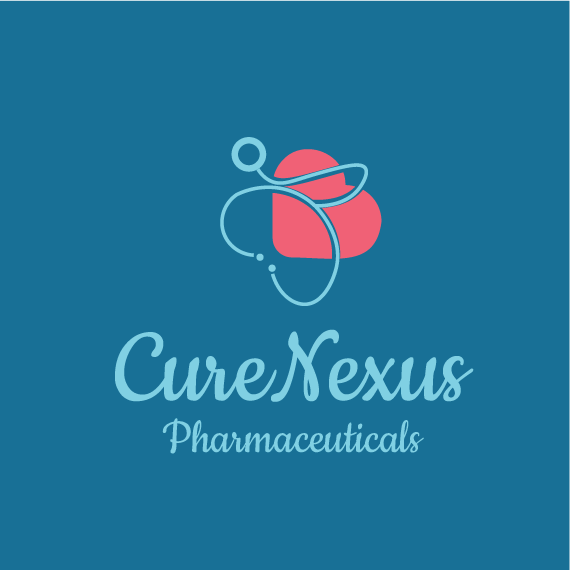
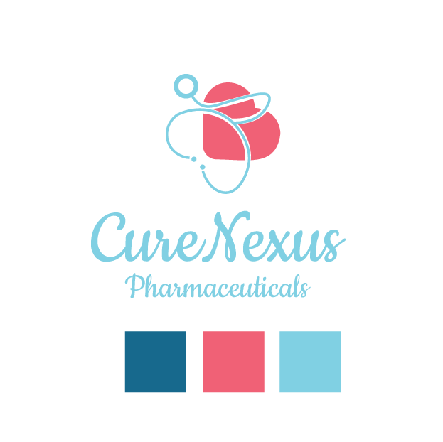
The founder of CureNexus, a visionary in the pharmaceutical space, had a clear dream but an incomplete execution. She brought a specific color palette and a core concept—the intersection of medical expertise and human compassion (the heart). Her original visualization, while earnest, relied on generic medical imagery and a script typeface that lacked the authority required for a modern pharmaceutical corporation.

2. The Strategic Pivot
From Literal to Symbolic
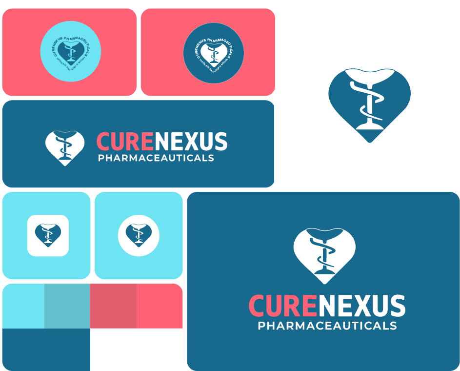
The goal was not to erase her work, but to honor and professionalize it. I moved the brand away from literal interpretations (the stethoscope) toward symbolic representation. I took her concept of the 'heart' and fused it with the Bowl of Hygieia (the universal symbol of pharmacy). This created a unique, ownable mark that signifies 'The Nexus of Cure and Care.'

3. The Execution: Typography & Color
We abandoned the script font for a robust, geometric sans-serif to instill a sense of stability, trust, and scientific precision. I took her original hex codes and balanced the ratios, using the Deep Teal as the primary anchor for trust and the Coral Pink as an accent for warmth, ensuring the brand felt human, not sterile.

4. The Execution: Turning Dreams to Reality
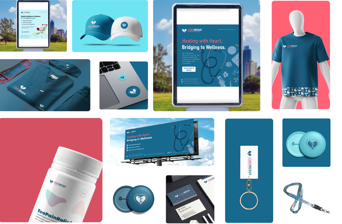
The final deliverable was a comprehensive Visual Identity System, not just a logo. This included primary and secondary logo variations, corporate stationery like letterheads and business cards, and mockups for scrubs, billboards, and packaging to help the client visualize her brand in the real world.

5. The Outcome
By refining the raw materials of the client’s vision, I delivered a brand identity that matched her professional ambition. The new CureNexus identity bridges the gap between technical pharmaceutical excellence and compassionate patient care. As I told the client: 'I took the best out of the rough visualization of her dreams... expanded and streamlined it... and finally turned her dream to reality.'

The Result
A True Digital Transformation
- ✓Retained the client's chosen color palette and emotional core (the Heart).
- ✓Transitioned the visual language from 'local clinic' to 'industry leader.'
- ✓Created a versatile identity system that could scale from a pill bottle to a highway billboard.
- ✓Developed a unique, ownable mark by fusing the 'heart' with the 'Bowl of Hygieia'.
- ✓Delivered a comprehensive Visual Identity System including logos, stationery, and mockups.